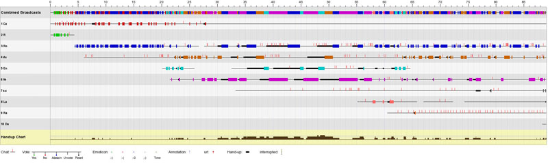
Anything that happens in a meeting, from booking the meeting, to displaying an emoticon, is logged on the servers. The meeting client communicates via PHP scripts on the server to log all the data to MySQL database tables. The metadata logged on the servers include booking logs, unique IP logs of meeting attendees, email addresses of signed-in users, replay hits and IP addresses of replay viewers, booking keywords, annotations, participant names, number and duration of broadcasts, chat logs, emoticons and URLs fired, interruptions, raised hands, and voting and whiteboard logs. The analysis shows the diverse use of audio and video, emoticons, voting and chat messages to achieve different communicative goals; emoticons are mostly used for social support and building a community, whilst audiovisual interaction is mostly used for actual work collaboration. The choice of these communication channels also varies according to the meeting type.
For our research, we can view data and statistics about the meetings in a variety of different ways including charts, lists and diagrams. For example, we can see the linear representation of a meeting, showing the attendee participation on a linear timeline in different colours, as well as all interaction patterns, i.e. chat messages exchanged, hands-up chart, types of emoticons, interruptions, annotations, URLs fired and votes. In the following visualisation, user 'Ca' in red colour was the first one to enter the meeting. This meeting included 10 participants, most of who contributed broadcasts and chat messages, except user 10, 'Da', who joined towards the end of the meeting and did not contribute anything:
We can also visualise the shape of a meeting linearly or as a polar area diagram, showing the type of meeting and the participant roles. Due to different communication patterns in different kinds of meetings, we have observed a range of meeting event types, such as peer-to-peer or moderated project meetings, interviews, seminars, web-casts and video lectures (Scott, Tomadaki and Quick, 2007) . Also, different attendee roles can be observed, such as peers, moderators or leaders and lurkers.
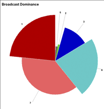
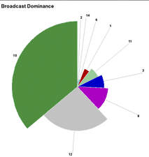
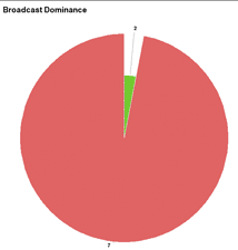
Florence Nightingale produced a 'polar area' diagram variant of a pie chart to provide a powerful illustration of the causes of death amongst the British forces in the Crimean War (Nightingale, 1858). She divided the pie chart into 12 equal segments representing the months in one year of the fighting. In the chart the area of different pie-segments in each of the 12 regions was used to show that the real enemies were cholera, typhus and other diseases. In these visualizations, Nightingale's insight was that the area of the segments was the strongest visual cue to the relationship between these complex factors. In our work we have tried to build upon this insight with our own variant of the polar area diagram. We have taken the linear representations of the meeting and combined them into polar area 'dominance' diagrams, which are automatically generated for each event. The broadcast dominance chart is a form of polar area diagram in which the circumference of the chart is divided according to each user's percentage of the total event audio-visual talk time. It excludes any 'silences' in the event, only counting the time in which users choose to take a turn to speak. So, in an hour-long event, if the combined broadcasts of all users totalled 50 minutes of that hour, then a participant who broadcast for 25 minutes would have half the chart circumference i.e. a segment of 180 degrees. In addition, the radius of each user's segment indicates the relative proportion of the number of broadcasts that the user made compared to the others. So in the case in which the user who took the most turns in that meeting, 'broadcast' 40 times, their segment would be drawn to the full radius of the chart, whilst the segment of a user who spoke 20 times would be drawn to only half the full radius. This means that we can define the broadcast dominance of a participant by the area of each chart segment, being a product of the proportion of the audio-visual time of the meeting by the number of audio-visual 'turns' taken.
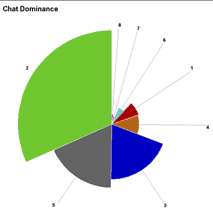
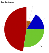
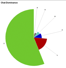
The 'chat dominance' chart is a similar polar area diagram whose circle is divided according to each user's percentage of the total chat message character count. So, for example, if 6000 text-chat characters were typed by all event participants, a user typing 3000 of these characters would be represented by a segment with an angle of 180 degrees, or half of the total chart circumference. In addition, the radius of each user's pie segment indicates the relative proportion of the number of chat messages that the user made compared to the number of messages of the most active participant. So, for example, if the most dominant 'texting' user issued a total of 40 text messages, they would have a segment drawn to the full radius of the illustration, whilst a user with 20 messages would have a segment drawn to only half the full radius. This means that we can define the chat dominance of a participant by the area of each chart segment, being a product of the proportion of the 'text typed' by the number of chat 'turns' taken.
It should be noted that our polar area visualizations are quite different to those of Florence Nightingale as the ordering of segments for us is a product of the analysis rather than an independent variable. Our dominance segments are ordered by area counter-clockwise from the top. The first segment has the largest area and the last segment has the least visible area. The numbers referred to in all subsequent figures represent the 'join' order of the participant (ie. the order in which they connect to the event).
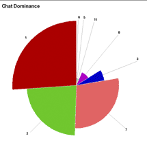
A variety of communities are holding peer-to-peer meetings on the servers. A community of animation students has held a series of interesting peer-to-peer meetings, some of which were made public. In these events, the students discuss common activities and collaborate on projects by expressing their views and answering each other's questions. Most of these meetings do not have a moderator, although certain students may be more dominant than others in certain communication channels. The figures below show a balanced spread of both broadcast and chat channels amongst the participants. Users 1 and 7 appear to have used the audio channel more than the chat channel, while users 2 and 5 have mostly used the chat channel rather than the audio channel.
A range of public replays of interviews are hosted on the server, focusing on e-Learning related issues. These events include two participants interchangeably taking turns. Usually, the interviewee occupies more than double of the time occupied by the interviewer, while the number of broadcasts is similar, resulting in a banal polar area diagram.
Series of seminars on 'Learning Objects and Metadata', 'Knowledge Mapping' etc. can be viewed at the webpage hosting the public replays. These seminars are organised by a leader/moderator, discussing different themes. All of the communication channels available are used in seminars: votes, shared URLs, raised hands, emoticons, chat messages. Usually the moderator dominates the broadcast, but other users dominate the chat, asking the moderator questions, which they answer via the broadcasting channel.
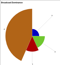
A similar pattern to the seminar can be visualised in meetings with moderators. In meetings with a high number of participants, the role of the moderator is important for the task distribution. In the following example, the meeting 'leader' dominates both air and chat. The shape shows similar air-dominance patterns as the seminar, as it is a moderated event for project collaborative work, although in this case, the moderator dominates both the audiovisual and chat channels.
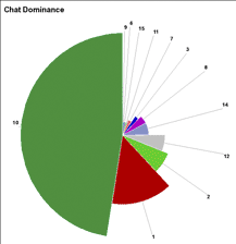
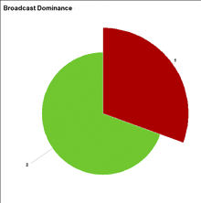
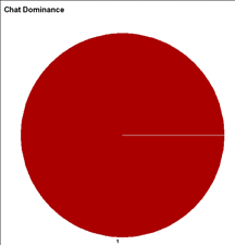
Meetings have been also used on several occasions for web-casting because of the replay function. The pattern showing a web-cast is obvious, as the main speaker appears in the visualisation covering nearly 100% of the total air time and nearly 2% of the total chat dominance. This type of event is a presentation intended to be replayed and thus the 'leader' prefers the audio channel rather than the chat channel to interact with the other participants. Interestingly, the other participants seem to be lurkers, not appearing at all at the broadcast dominance diagram, while they are indeed there, as they appear actively in the chat diagram.
Video lectures are very similar in visualisation patterns with the web-casts. These events may also be used for this purpose, but are more interactive than web-casts, presenting a rich activity in different communication channels, such as emoticons and text chat, as well as slide presentation. In video lectures, the shape shows again the main speaker occupying nearly all of the air time, participating also in the chat, in contrast with web-casts.
Nightingale, F. (1858). Notes on Matters Affecting the Health, Efficiency, and Hospital Administration of the British Army. Founded Chiefly on the Experience of the Late War. Presented by Request to the Secretary of State for War. Privately printed for Miss Nightingale, Harrison and Sons.


